Technology
Using component mixins in SCSS
In the latest redesign of the Exove site, the visual look of many UI elements and widgets is reused all over the project. For example, the appearance properties and inner structure of a block which we might call a “teaser” can be found not only in teasers themselves but also in headers that precede a group of post teasers, in hero blocks of some templates and so on. This is relevant to many UI based digital projects — design reusability can be higher or lower depending on many things.
A web of interdependencies or discontinuities between various design constants is often complex. Design of teasers for events and blog posts, for example, can be the same for the inner visuals — padding, typography, and backgrounds, and differ in terms of dimensions and positioning. We may often want teasers to have the same general design but be laid out onto a grid with varying number of columns.
We may also want some aspects of appearance to override the base design — for example, change a font color or align content in some other way. Or we may need to add something completely new, such as fancy hover animation for a part of teaser of an employee, like the one the Exove site is enjoying now.
Modularity of design can be described well by SCSS with mixins, functions, and better @import instructions, increasing the DRYness of a project and ease of its maintenance. However, planning of front-end architecture that encourages design reusability is a difficult task.
Having separated components in SCSS is a no-brainer and usual practice for many developers. But how to group those components so they could inherit some standard visual looks while changing them where needed? And how to make the whole thing not collapse when the project design starts to change during the implementation and some block design starts to serve as a base for other blocks? In other words, when a client starts to say the inevitable words “I like the design of this hero, could you make this new thing look the same”?
Borrowing the general principles of OOCSS may certainly help here but is not enough. Commonly, object oriented CSS helps with separating different components from each other. However, when some level of inheritance between components design is needed, things get complicated. Another problem arising here is more technical in nature. Specificity is a great tool given us by CSS but keeping different parts of styling from clashing with each other also can easily unfurl into a proper nightmare.
How could we apply base design and more specific design on multiple levels to the same group of HTML elements without having a lot of classes in the markup that would fight to death causing gross tricks to emerge such as !important or unreadable overqualified selectors? Ideally, it would be best to keep each piece of styling associated with a selector consisting only from one class (excluding base HTML styling of course such as the one provided by normalize.css).
Here are all of our headaches in a simple list:
-
1
The SCSS should be as DRY as possible, mirroring the design structure of the project layouts. If the project designer reuses a common design pattern in several unrelated blocks/templates — we should reflect that in our codebase by not simply duplicating code but by isolating the pattern and its variations and implementing them correspondingly.
-
2
We should be able to apply to different components both the common design pattern as well as individual styling specific for them. New components forked off other ones should arise when it makes sense.
-
3
Not only the base design but also the design of any component derived from it should stay reusable. In other words, it should be possible to fork easily not only a base teaser design but, say, a contact card teaser design derived from it.
-
4
There should be a conceptually clear and easy way to apply context-dependent styling to components contained inside other components.
-
5
We need to have as little specificity related trouble as possible. For instance, we need to keep the number of classes in markup low. Optimally, the same component with all of it inner structure could be applied to classes named differently.
We tried to address these problems while we were working on the new redesign of the Exove site, and this blog post aims to describe and discuss the practices that we used.
Methodology
It is not in the scope of this post to dive into OOCSS principles, but the main guidelines that we can borrow from them are given in the list below. We don’t follow any specific existing OOCSS system but they should be compatible with Harry Roberts’ ITCSS and other systems such as BEM.
-
1
We could use the components concept for any independently styled block on a page (teaser could be a typical component). A component has a unique base class set, such as c-teaser.
-
2
We utilize elements (atomic parts of a component) and modifiers (states of a component or element that change the appearance based on some condition) to help describe the structure and states of a component. Both elements and modifiers have classes set with the prefix of such a class being the component name. For example, an element could be named c-teaser__title and a modifier c-teaser_compact.
-
3
An object term would refer to a piece of styling that usually is not to be used alone but that helps to reduce repetitiveness of code. Objects don’t have classes on their own so they only work as mixins or extends. They still may have inner elements or modifiers. There may be different kinds of objects (utility objects such as u-clearfix or “skin” ones such as t-inlined-icon) but this is out of the scope of the post.
Notice the use of prefixes for both classes and mixins such as c- (component), u- (utility), o-(object) and so on. These are ideated by Harry Roberts as “namespaces”. They are optional but help to quickly get the idea what a mixin would do.
Mixins to rescue
So, one way to apply different styling to the same group of HTML elements would be to simply add multiple classes to it. This however may cause specificity problems with one class overriding another, and make maintenance harder. A better way is to use mixins. Each component would have a mixin associated with it that would fully describe its styling. If all components have their styling defined in mixins, it means that we can easily reuse any of them. (BTW why we don’t use extends instead of mixins? Read more here.)
There’s a problem with enclosing styling for a component into mixin: as indicated earlier the elements that are supposed to represent smaller parts of a component each are bound to a separate class. How would we combine elements with the mixin implementation of a component? The answer is simple — we would have the base class of the component defined as the mixin parameter, and all of the classes of elements and modifiers would have this parameter as a prefix for their class:
@mixin c-teaser($base_class) {

    // styling applied to the component root
    border:1px black solid;

    @at-root {
        #{$base_class}__title {
            ...
        }
        #{$base_class}_compact {
            ...
        }
    }
}
Now we can apply this mixin to an HTML element with class c-teaser, having a child element c-teaser__title and optionally a modifier class c-teaser_compact, OR, we could have it applied to another HTML element, say, c-contact-card, with a child c-contact-card__title and a modifier c-contact-card_compact. All the styling for this component and its children would be applied to both groups of HTML tags.
Note the use of @at-root: we need to enclose all the elements’ and modifiers’ declarations into this directive to avoid overqualified selectors containing both component and element classes. The element class, being prefixed with the component name, would be already unique enough. Every selector would have then only one class in it, which is good for keeping specificity under control.
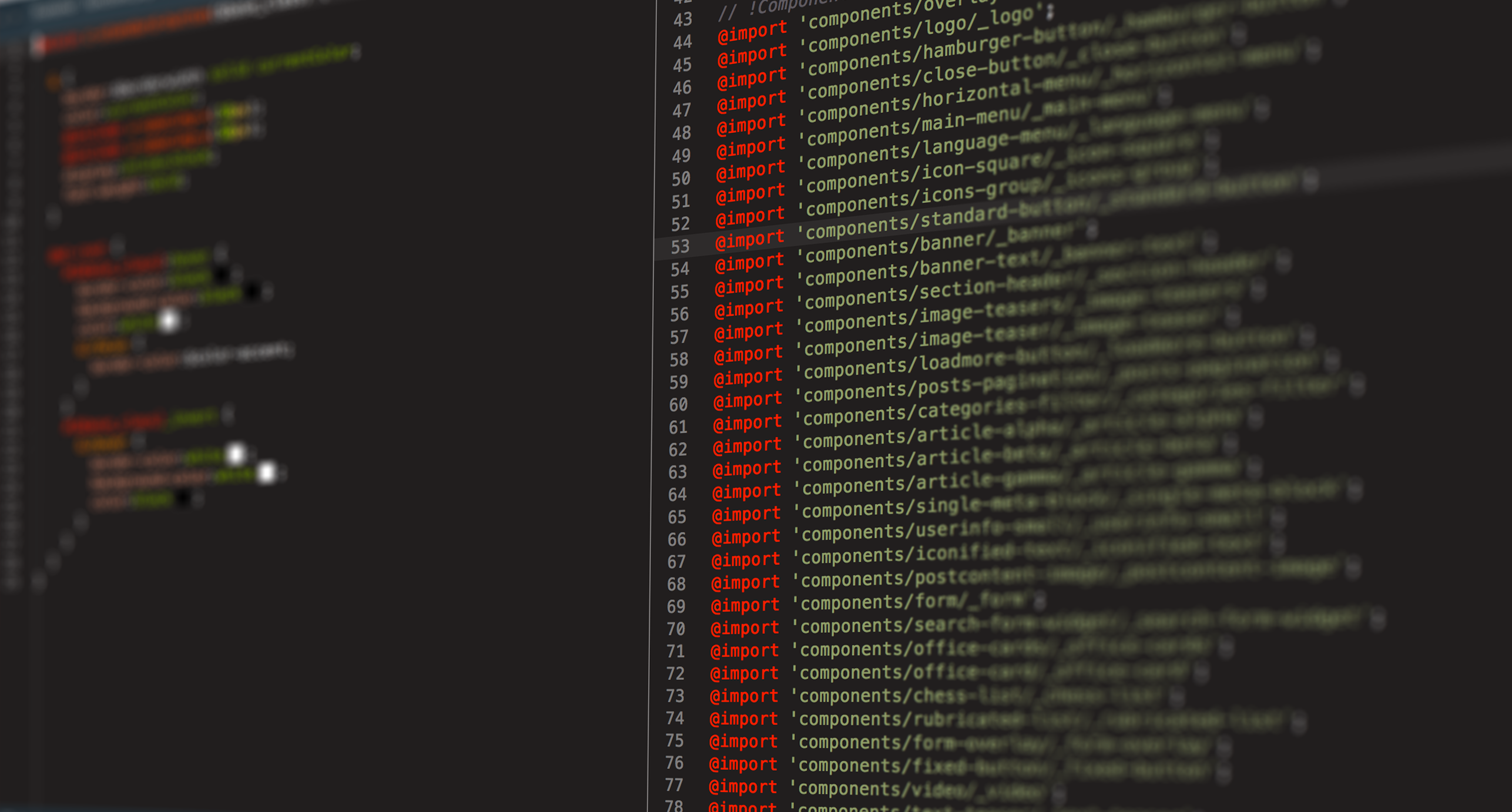
In this project we have kept every mixin in its own file and applied all the mixins to classes in a common file named for example apply-components.scss:
.c-category-filter {
  @include c-filter(&);
}
.c-post-filter {
  @include c-filter(&, $compact:true, $highlight-color:red);
}
.c-language-menu {
  @include c-language-menu(&);
}
The ampersand as the first argument basically takes the actual class to which the mixin gets applied to serve as the prefix for its elements and modifiers. Note also how we can of course add any number of arguments to a component mixin that will modify the styling to our taste.
For this scheme to work the naming of elements should be highly consistent so that a __title element of one component could be easily restylable with another component. This would probably mean that you need to have some unified system for different developers to name various things — metas, headings, images, links and so on.
Finally, it’s not always necessary to create more and more components when there’s a bit of difference in structure or styling between two variations on the same base design. Generally,
-
1
if there is variation in structure — we can just add new elements to the base component without forking it into a new component
-
2
if there is variation in styling — we can add modifiers to either component or its elements.
Too much variation still means that having a new component might be more sensible. Deciding which way to go will likely depend on each specific case.
It is reasonable that almost all of the styling on a site would be contained in component mixins. An exception might be only made for highly unique styling that has a very low chance of being encountered somewhere else (for example, on the new Exove site most of the footer styles are non componentized).
Separation of layout and inner theming for higher reusability
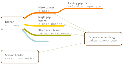
In some cases it might make sense to reuse not all of the component but just its inner, non layout related styling (called “skin” sometimes) — padding, background, borders, typography and so on. A solution for this would be quite obvious — we would create a separate mixin! It could be considered an object and not component, because such styling would not be usually applied to a class on its own, being only included as a part of another mixin instead. The division is not strict however, and such an object could develop into a component if needed. See an example:
// one component file
@mixin c-teaser($base_class) {
    @include o-teaser-content(&);
}

// another component file
@mixin c-hero($base_class) {
    @include o-teaser-content(&);
}
Optimizing the styling of components inside components
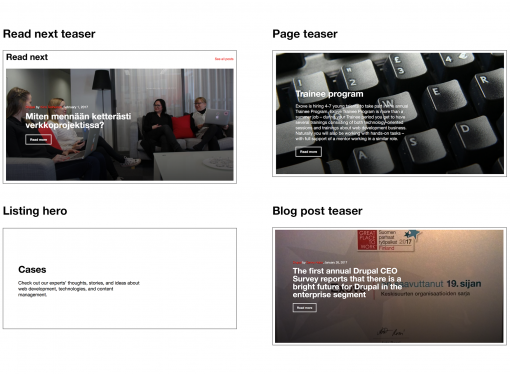
In an OOCSS-enabled project, it often makes sense to add a component (say a read more button) inside another component (a teaser). The same separation of concerns logic can be applied to groups of similar items, such as sections of repeated content, lists, slideshows and so on. It is good to have a mixin for the whole group and a separate one for the inner styling of each item. Some changing visual properties such as gutters between items could fit perfectly as a part of the group component’s modifier. This way a single teaser design can always be repurposed for another, possibly standalone, component, without bringing unnecessary styling with it into the new environment.
To allow for styling an inner item as both a separate component and a part of a larger parent component at the same time, we may apply two classes to each child’s tag:
<article class="c-teaser">
    <a href="" class="c-teaser__readmore c-button">
        Read more
    </a>
</article>
or
<ul class="c-teaser-group">
    <li class="c-teaser-group__item c-teaser">
        Item one
    </li>
    <li class="c-teaser-group__item c-teaser">
        Item two
    </li>
</ul>
It might be tempting to skip adding the second class by including the c-teaser mixin within the .c-teaser-group__item element declaration, but if you’ve studied BEM (for example) you probably remember that an element there cannot have elements of its own as this degrades reusability. If the c-teaser component itself contains any elements, the emergence of sub-elements is inevitable, and that is something we need to avoid.
Troubles with (re-)naming
Picking names is always hard, and more so in regard to ever-changing front-end components. This task might never be solved in a completely perfect manner because different people understand the same terms differently. Take the quite typical word “block” for instance — developers coming from the worlds of Drupal, BEM, WordPress would not understand it in the same way. Here are a few tips that may theoretically help to keep naming less tedious with lower chance for a need for renaming.
-
1
A component that was improvidently created for pagination first and named c-pagination can easily outgrow itself and at the end of the day be found to be used with menus, filters, and so on. The only cure here is to have a glance over all the layouts in a project before starting to work and maybe even create a list or scheme of all the similar components that might be needed. Seeing in advance that the same design block is reused in many places will surely help to avoid names that are too narrow or too general.
-
2
When thinking of a good name, it always helps to distance oneself from the functionality provided by a component and describe it more in terms of visual look (say, you could use c-alternating-list instead of c-careers-advantages). This way the name will stay appropriate when reused in different templates and in different context.
-
3
Having suffixes that indicate whether the component represents a group of items (-list, -group, or just the plural marker s) might be a good idea.
-
4
It might even make sense to have the names and the contents of a component even more separated, assigning metaphorical or random names — this way a component will never have to be renamed!
Conclusion
To sum up, in order to build a flexible SCSS architecture that promotes inheritance and DRYness, we may need:
-
1
stick to any desired OOCSS methodology.
-
2
make components into mixins with a parameter for base class.
-
3
learn that components can be used as elements of other components and separate the styling accordingly.
-
4
isolate a component’s content styling as a separate mixin if it seems feasible.
-
5
adhere to common naming of elements among different components.
Categories:
Technology
Share on social media: